
Projects are a good way to store tasks and a bad way to decide what to do next. Once you have more than a handful, the tasks that matter sit in folders you did not open this week. A review fixes that — if you can see everything at once.
Why one screen matters
The idea comes from David Allen’s Getting Things Done. The GTD Weekly Review has three phases: get clear (empty your inbox and your head), get current (go through your lists, calendar and projects) and get creative (look at someday/maybe ideas). The David Allen Company calls the review the critical success factor for keeping the system working.
“Get current” is the step most apps make hard. Opening fifteen projects one after another is slow, so people skip it. A single cross-project view turns it into scrolling: you see which projects have no next action, which tasks have been sitting for a month, and which three things are really urgent.
Daily vs weekly review
Daily (about five minutes)
- Look at what is left from yesterday. Keep it, move it back to a backlog, or delete it — do not let it roll over silently.
- Scan high-priority tasks across all projects and pick three to five for today.
- Clear quick captures from your inbox into projects.
Weekly (30–60 minutes)
- 1
Empty the inbox
Every captured item gets a project, a date or the bin.
- 2
Walk every active project
Each one should have at least one concrete next task. A project with none is stalled — decide whether to pause it.
- 3
Re-prioritise
Priorities set two weeks ago are usually stale. Remove the flag from anything that is no longer urgent.
- 4
Check paused and idea-stage projects
This is the “get creative” part: is anything ready to start, or ready to drop?
- 5
Look back at the week
What got done and how long it took. If you track time, compare with your guesses — see estimated vs actual time.
How to get one screen in Todoist, TickTick and Notion
Todoist: filters
Todoist filters are saved queries that search across all your projects. You combine conditions with & (and), | (or) and ! (not) — for example (today | overdue) & #Work. For a review, a filter on priority across all projects works well, and the built-in Upcoming view shows tasks due in the next seven days across projects. Note that, according to Todoist’s help, completed tasks do not appear in filter views.
TickTick: smart lists and filters
TickTick has built-in smart lists such as All, Today, Tomorrow and Next 7 Days, which you can show or hide in settings. For a review view, a custom filter can combine lists, dates, priorities and tags; the advanced mode supports AND/OR conditions.
Notion: one tasks database, several views
In Notion the trick is structural: keep all tasks in one database with a relation or select property for the project, rather than a separate task list on each project page. Then add views with filters, sorts and groups — for example “open tasks, grouped by project, sorted by priority”. If your tasks are spread across many databases, no single view will collect them.
The Review page in Kodimu
Kodimu, our app, was built around this screen. The Review page shows every task from every project at once, as collapsible project cards, together with Inbox tasks.
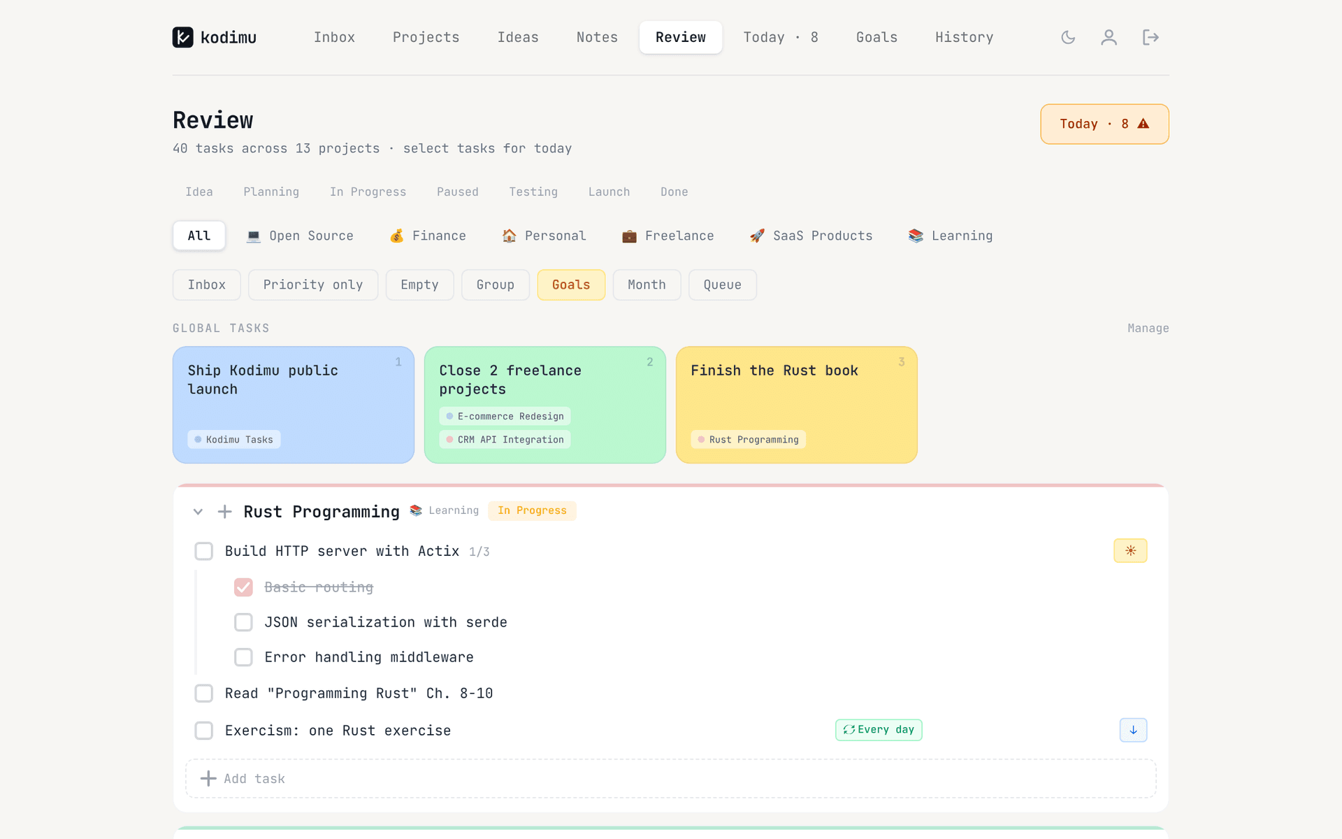
- Filters: project stage (several at once — e.g. only In Progress and Testing), category, Inbox on/off, “Priority only”, show or hide empty projects, group by category. Filters are remembered between visits.
- Pick for Today: tick a task and it goes to the Today list. That is the daily review in one click per task.
- Queue: a “next up” backlog you can show on the same page. When yesterday’s Today tasks are left unfinished, Kodimu asks whether to keep them on Today, move them all to the Queue, or decide one by one.
- Inline add: add a task to any project directly from its card while you review.
- Goals and Month progress: optional toggles that show up to four goals and the month’s progress on the same page, useful for the weekly look back.
Task text and project names are encrypted in your browser before upload; stages, priorities and dates are not. See the security page for the full list, and the Review guide for a walkthrough.
Where this approach falls short
One cross-project screen is not the right tool for everything:
- Date-driven work. If your week is shaped by deadlines and meetings, a calendar or an “upcoming” view is more useful than a project list. Kodimu has no calendar view and no calendar integration.
- Very large backlogs. Hundreds of tasks on one screen stop being a review. Use filters aggressively, or archive.
- Reviewing on your phone. Kodimu is a web app without native mobile apps; Todoist and TickTick have mature apps on every platform.
- Teams. Kodimu is single-user. For shared projects, a filter in a team tool is the better fit.
FAQ
- How do I see all tasks from all projects in one place?
- Use a cross-project view: a filter in Todoist, the All smart list or a custom filter in TickTick, a single tasks database with a filtered view in Notion, or the Review page in Kodimu.
- How long should a weekly review take?
- Usually 30 to 60 minutes. The first few take longer because the backlog has not been cleaned in a while.
- What is the difference between a daily and a weekly review?
- The daily review picks today’s tasks from what already exists. The weekly review changes the system: it clears the inbox, checks every project has a next step and resets priorities.
- Which app is best for a GTD weekly review?
- The one whose cross-project view you will actually open. Todoist filters are flexible, Notion views are customisable, and Kodimu shows all projects on one Review page by default.
Sources
- Getting Things Done — The GTD Weekly Review — read 2026-10-21
- Getting Things Done — GTD Best Practices: Review (part 4 of 5) — read 2026-10-21
- Todoist Help — Introduction to filters — read 2026-10-21
- Todoist Help — Upcoming view — read 2026-10-21
- TickTick Help — Manage tasks with lists — read 2026-10-21
- TickTick Help — Filters — read 2026-10-21
- Notion Help — Database views, filters, sorts & groups — read 2026-10-21